


I was fundamental in developing the design of Tribe Magazine. Firstly, they already had their lovely logo and an illustrations just right for the target age group. What they needed was someone to progress and bring all these elements together to their vision. I created a fun, inspiring and accessible family magazine and really helped them launch their first issue.
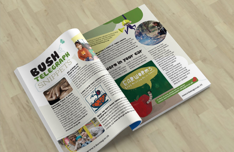
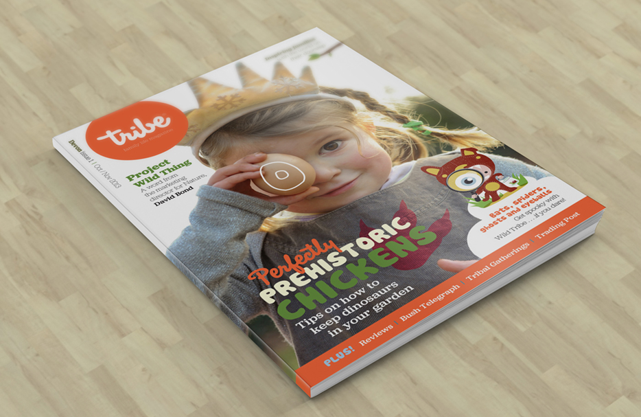
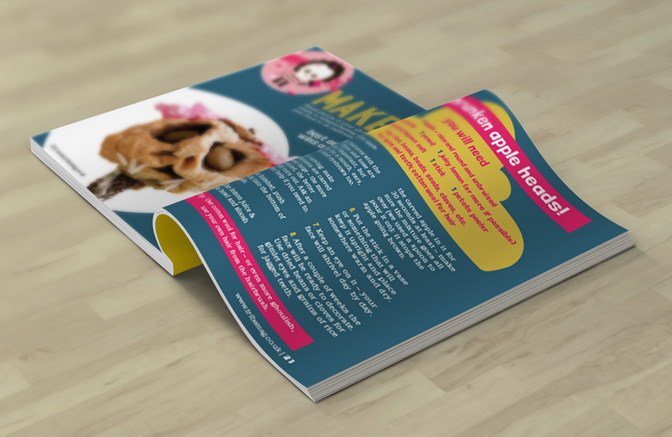
The pages needed to be clear, bright and palatable for children. Pieces I designed included a news spread called Bush Telegraph Snippets. Another to get kids into creativity was the Makers segment. I used pull-out quotes to draw in little eyes, along with large and accessible text and images. Importantly, the front cover design needed to have impact to get parents’ attention. That’s why I kept it simple, featuring two main stories and upsized the cover story illustration and photo. The effect of my colourful designs were accentuated in print by the quality matt paper stock. The launch issue was then distributed in the Southwest of England in bright paper envelopes. In conclusion, Tribe magazine design had great starting assets which I developed and pulled together.
Another children’s publication, please also check out my design work for Whizz Pop Bang magazine.